

In the far end of the Mediterranean, two artists are expressing the reality of surfing wind swells in the city, on what is essentially a very large lake. No almond barrels, no marshmallow colored lines of perfect swell. Chop, closeout pollution and bliss: these are the words that can more accurately describe the colorful works of Tal Viderman and Priel Hackim.
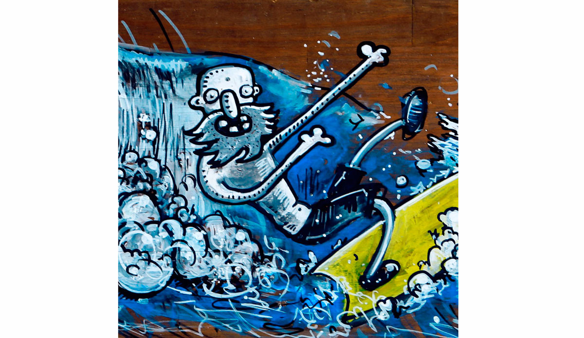
Baba. The urban surf monk surfs between barrels of toxic waste and dead fish, with a humble smile on his face and fire in his eyes. The grim reality of Baba’s world is contrasted by the bright oil colors used by Priel Hakim to create this fictional character. “Baba was born to remind us to be happy with what we have,” Priel says, “and to learn from the ocean we can overcome and be happy in almost every situation.”
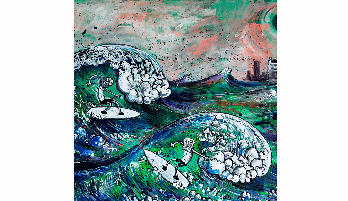
The bright color explosions of Tal Viderman explore the same theme. His works include stencils of a breaking waves or a surfer, interpreted with many shapes and colors in a series. These works are inspired by Tal’s home break which he refers to as Kalifornia. The intentional spelling pun is part of what describes the spot perfectly in Tal’s own words: “Yes, this wave looks like shit, but it feels perfect. For me it’s the best wave in the world.”
Despite the differences in their works, both artists have adopted a dirty, gritty urban line to their surf art, with inspiration from the world of graffiti and graphic novels. They both seem to capture the very essence of how it feels to be city surfers: Surfing junk as if it were gems.