
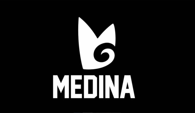
Gabriel Medina wanted a logo that would inspire people to “remember me, what I’ve done, who I am, the athlete I am.” Image: IMX
Gabriel Medina’s recent split from Rip Curl after 17 years sent shockwaves through the surfing world. One of the longest and most iconic partnerships in modern surf history came to an abrupt end — and immediately sparked the inevitable question: what comes next?
Since the announcement, speculation has been rampant. Some believe Medina could follow a path similar to Kelly Slater with Outerknown or John John Florence with Florence Marine X, building something of his own after stepping away from a traditional surfwear brand.
What many don’t realize, however, is that Medina had already flirted with that idea long before he became a world champion.
Back in 2013, still without a world title to his name, Medina launched his own personal logo — not as a full commercial brand, but as a symbol of identity. Inspired by sport icons, the idea was simple: create a visual mark people would instantly associate with him.
“I’m a big fan of Michael Jordan and Ayrton Senna. When I saw Senna’s ‘S,’ I immediately thought of him,” Medina said at the launch event at that time. “When I saw the Jumpman logo, I knew right away it was Jordan. That’s what I want — for people to see my logo and remember me, what I’ve done, who I am, the athlete I am. I hope one day I can be that guy.”
Created by renowned Brazilian advertising executive and surfer Marcello Serpa, the logo drew inspiration from surfboards, waves, and the letters “G” and “M.”
“They asked me to create a brand for him, and I said yes, since I had been following him since his junior competitions. The logo is very simple. I tried to incorporate his initials, and as I sketched, I ended up with the wave, the boards. It’s kind of an organic brand; it doesn’t have to be just black and white or a single color — it can have different versions, open to movement. It’s not static, it’s alive, and it can last a long time,” Serpa explained at the launch event.
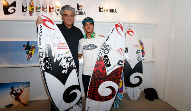
Gabriel Medina had a logo. Could it come back? Photo: IMX
The original idea was for it to appear on Medina’s boards, Jet Skis, headphones, and apparel, with early plans for licensed products and even an e-commerce platform.
Despite early momentum, those plans never fully materialized, and the logo was gradually shelved as Medina’s competitive career accelerated.
Revisiting this idea now wouldn’t be out of place. What began as a personal vision in 2013 came at a time when Medina was still chasing his first world title and building his global identity. More than a decade later, he is a three-time world champion, an Olympic medalist, and one of the most recognizable figures in modern surfing. He’s a very different athlete in a very different position.
That evolution has already shown itself off the water. In recent years, Medina has dipped back into entrepreneurship, launching Medininha, a children’s product line, and investing in Beyond The Club, a wave pool complex in São Paulo. While linking the nose of his board to one of his own ventures isn’t impossible, market conversations suggest it remains a less likely scenario.
Still, viewed through that lens, Medina’s forgotten logo feels less like a relic of the past and more like an unfinished idea. What once seemed premature — launched before titles and global recognition — now carries a very different weight. With his competitive legacy established and his personal brand stronger than ever, revisiting that early vision wouldn’t just be nostalgic, it would be timely.
